We've completely redesigned Cableizer with a focus on two key improvements: a clearer structural organization using three topics, and a truly responsive interface that works seamlessly on desktop, tablet, and mobile.
Posted 2026-07-05
Categories:
User experience
With the split of the overloaded and difficult to use electrical module into three specific modules (parameters, induced voltage, lines) we also restructured the start page to make it logic and easier to use. At the same time we also completely redesigned the whole page to be responsive and better usable on tablets and mobile phones for a more flexible use and a better user experience.
At the heart of the redesign is a clearer organizational structure. Both Projects and Tools now use the same three-topic framework — Rating, Electrical, and Mechanical — but in different ways:
Storage: Persistent database
Access: Via libraries
Perfect for: Long-term work, collaboration, and documentation
Storage: Temporary local storage
Access: Standalone applications
Perfect for: Quick calculations and one-off analysis
Cable rating calculations for different types of installation and environmental conditions from buried cables in soil and seabed over cables in air to cables in air-space such as tunnels, troughs and risers. Most types of installations can also run calculations with heat sources and GIL/PAC.
Electrical calculations of different type: Electrical parameters according to CIGRE TB, induced voltage according to IEEE, and long power line analysis using telegrapher equation. Electrical calculations are only available for cables.
Mechanical calculations such as mechanical forces due to short circuits or heat elongation or cable pulling. Mechanical calculations are only available for cables.
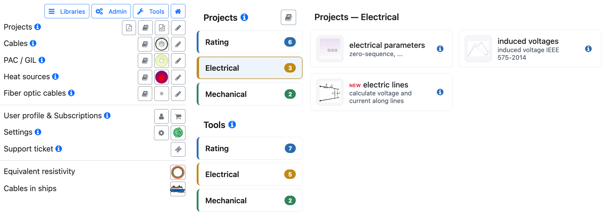
To complement this clearer structure, we've redesigned the entire interface to be truly responsive. Whether you're at your desk, in a meeting with a tablet, or checking specifications on your phone, Cableizer adapts to your screen size.
On larger screens, you get the complete Cableizer experience. The sidebar is always visible at 420px wide, giving you quick access to all libraries and tools. The main content area displays all filter options with complete labels and units, and the navigation bar shows every option at once.
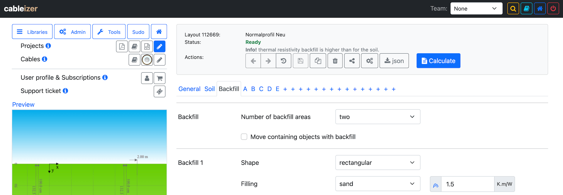
On medium-sized screens, the sidebar remains visible but the content adjusts with reduced font sizes and tighter spacing. All functionality stays accessible without requiring scrolling.
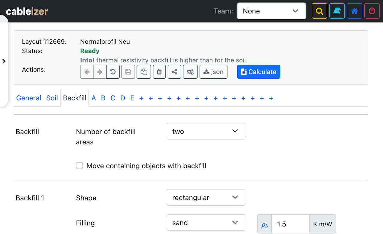
Tablets transform the sidebar into a slide-in drawer that overlays the content, freeing up horizontal space. The navigation adapts to fit the narrower screen while keeping all essential functions visible. A pill-shaped toggle button on the left edge makes it easy to open and close the sidebar with a single tap.
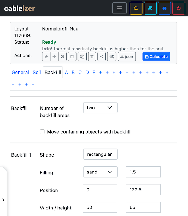
On mobile devices, the interface becomes highly optimized. The hamburger menu consolidates the team selector and search. The sidebar becomes a compact slide-in drawer. Most importantly, filter panels intelligently hide redundant labels — the row labels clearly identify each field, so the mathematical symbols and unit labels are removed to maximize space for the actual input fields.
The three-topic structure benefits from the responsive design in important ways:
The redesign uses four strategic breakpoints:
| Screen Size | Device Type | Key Features |
|---|---|---|
| ≥1280px | Desktop | Sidebar always visible (420px), all labels visible, full navigation |
| 992–1279px | Compact Desktop | Sidebar visible (420px), reduced padding/font, optimized spacing |
| 481–991px | Tablet | Sidebar drawer (400px), inline navigation, filter labels visible |
| ≤480px | Mobile | Sidebar drawer (400px), hamburger menu, filter labels hidden |
On mobile specifically, we hide input group labels (like Un, Ac, Dins) to maximize input field width, while keeping the separator dashes between range inputs and the row labels that identify each filter.
This redesign addresses two critical needs:
The three-topic structure makes it easier to understand what projects and tools do, and to find exactly what you need.
Mobile usage of Cableizer has been growing. Rather than forcing a desktop layout onto small screens, we've redesigned the entire interface to be genuinely optimized for each device.
The result is an interface that's not just smaller on mobile — it's smarter. Filters adapt to available space. Navigation reorganizes for touch. The sidebar transforms from a permanent fixture to an on-demand drawer. Yet the core structure and functionality remain consistent across all devices.
This redesign was the foundation for additional improvements: Filtering and Search, both will be covered in a separate post.
We'd love to hear how the redesign works for you. Whether you're using Cableizer on desktop, tablet, or mobile, your feedback helps us continue to improve. If you encounter any issues or have suggestions, please reach out to our support team.